Code
library(tidyverse)Calling the Library:
library(tidyverse)Reading the File:
BOOKS <- read.csv("goodreads_Top100_YoungAdultFiction1.csv")An overview of the length of these books. A Histogram.
#Book length (number of pages)
fig <- ggplot(BOOKS, aes(pages))+ geom_histogram(binwidth = 20, fill="blue")

#Style
fig_labs <- labs(title = "Number of Pages for Top 100 Young Adult Books",
                 x = "Number of Pages",
                 y = "Number of Books")

fig_theme <- theme(panel.background=element_rect(fill="beige"))

#Showing figure 4
fig <- fig + fig_labs + fig_theme

print(fig)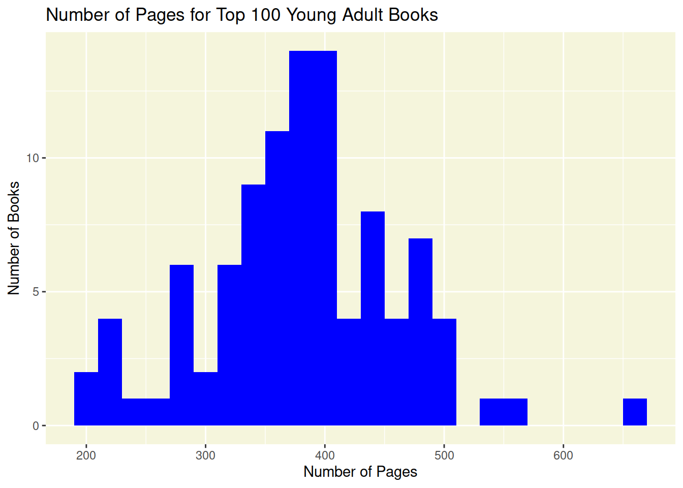
Series vs Non-Series. A bar plot… maybe?
I would like to figure out how to make this with two bars, one for series and one for stand-alone books. Or I would like to change the labels on the bars.
#Series vs non-series
#BOOKS$series_Q <- ifelse(is.na(BOOKS$series), "Stand Alone", "Series")

fig <- ggplot(BOOKS, aes(x = numberOfSeries))+ geom_bar(position = "dodge", color = "navy", fill = "blue")

#Style
fig_label <- labs(title = "Books in Series Vs. Stand Alones",
                  x = "Position in Series",
                  y = "Number of Books")
fig_theme <- theme(panel.background=element_rect(fill="white"))

#Showing figure 4
fig <- fig + fig_label + fig_theme

print(fig)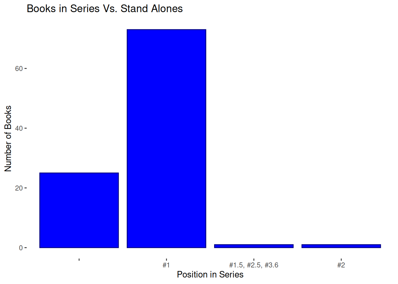
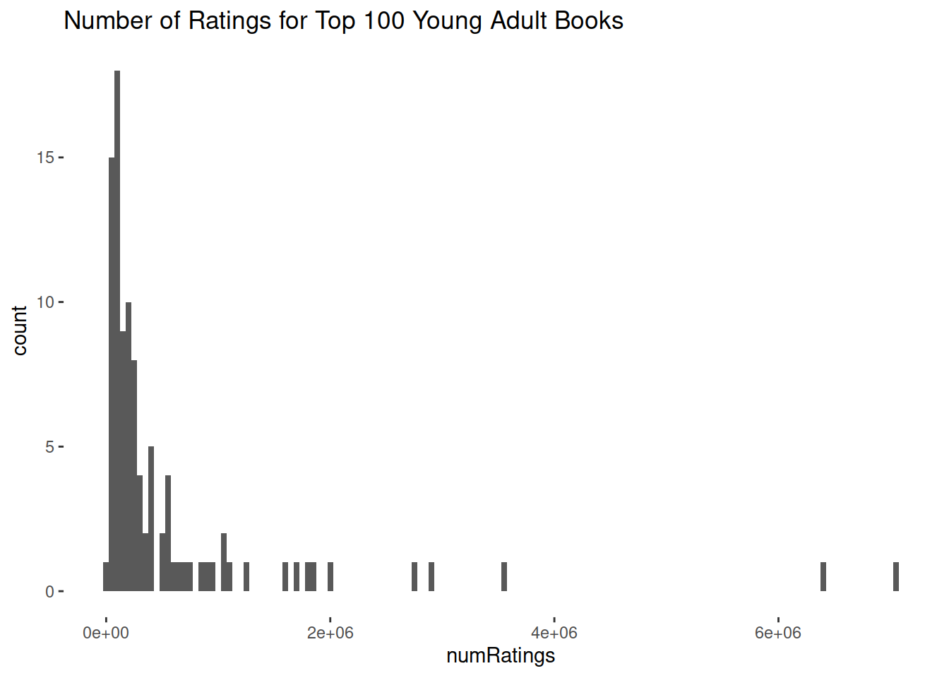
How Popular of these books?
A histogram of the number of books with a certain rating and a scatter plot of ratings vs. number of ratings.
#Number of Ratings
suppressWarnings({
fig <- ggplot(BOOKS, aes(x = numRatings))+ geom_histogram(binwidth = 50000)

#Style
fig_labs <- labs(title = "Number of Ratings for Top 100 Young Adult Books")

fig_theme <- theme(panel.background=element_rect(fill="white"))

#Showing figure 4
fig <- fig + fig_labs + fig_theme

print(fig)
})
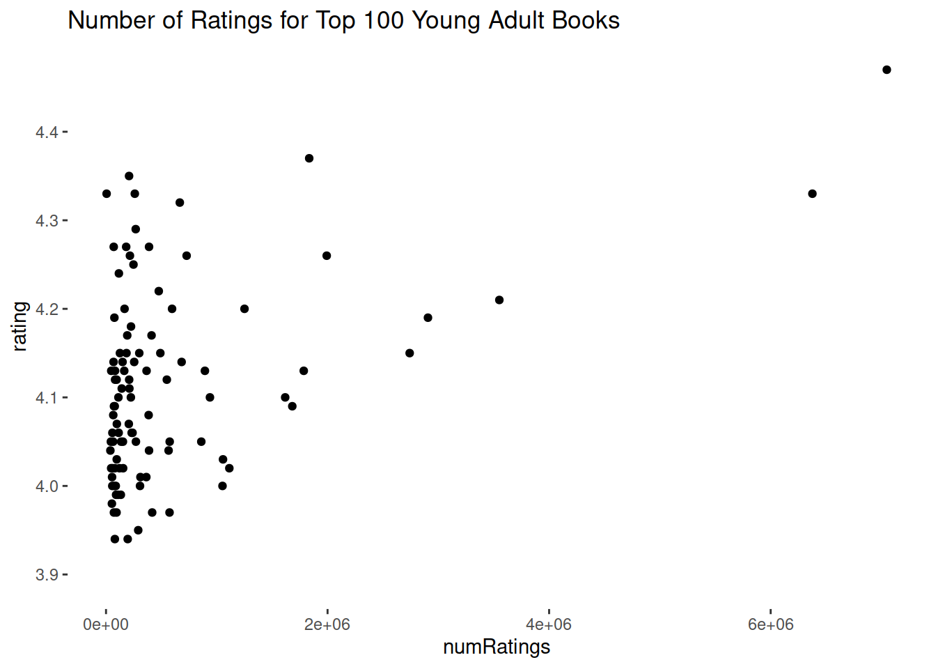
Number of Ratings vs. Rating
#Number of Ratings vs. Rating
suppressWarnings({
fig <- ggplot(BOOKS, aes(x = numRatings, y = rating))+ geom_point()

#Style
fig_labs <- labs(title = "Number of Ratings for Top 100 Young Adult Books")

fig_theme <- theme(panel.background=element_rect(fill="white"))

#Showing figure 4
fig <- fig + fig_labs + fig_theme

print(fig)
})
Book Format
This is an irrelevant graph because the book format is random and depends only on what version of the book was uploaded to the list by whoever uploaded it. I just wanted to practice making the graph.
fig <- ggplot(BOOKS, aes(x = bookFormat))+ geom_bar(position = "dodge", color = "red", fill = "pink")

#Style
fig_label <- labs(title = "Books format: a completly useless graph")
fig_theme <- theme(panel.background=element_rect(fill="white"))

#Showing figure 4
fig <- fig + fig_label + fig_theme

print(fig)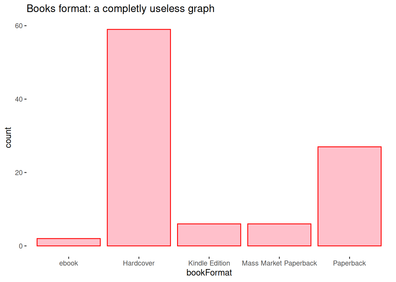
Number of Ratings
#Number of Ratings
fig <- ggplot(BOOKS, aes(x = publishedYear))+ geom_histogram(binwidth = 1)

#Style
fig_labs <- labs(title = "Number of Ratings for Top 100 Young Adult Books")

fig_theme <- theme(panel.background=element_rect(fill="white"))

#Showing figure 4
fig <- fig + fig_labs + fig_theme

print(fig)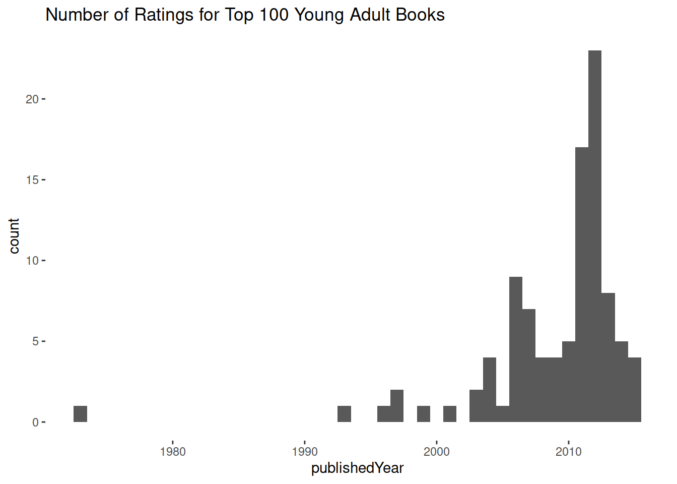
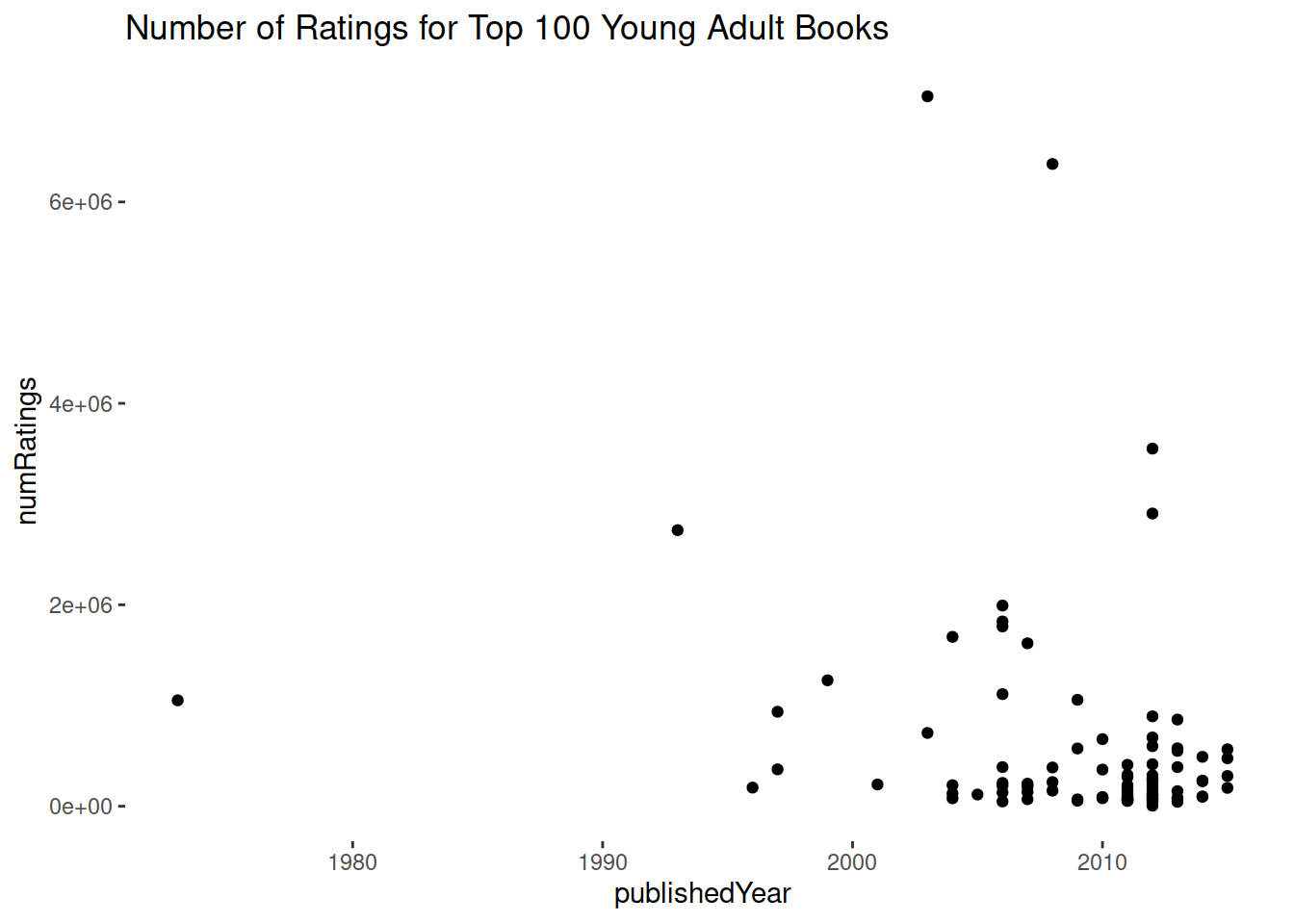
Rating Per Year
#Number of Ratings vs. Rating
suppressWarnings({

fig <- ggplot(BOOKS, aes(x = publishedYear, y = numRatings))+ geom_point()

#Style
fig_labs <- labs(title = "Number of Ratings for Top 100 Young Adult Books")

fig_theme <- theme(panel.background=element_rect(fill="white"))

#Showing figure 4
fig <- fig + fig_labs + fig_theme

print(fig)

})